Brams Pop: A Distinctive Display Font for Digital Design
As a UI designer who builds landing pages, SaaS dashboards, and conversion-focused e-commerce experiences, I pay close attention to how typography shapes perception before the first word is read. Brams Pop stands out—not just visually, but functionally—among modern display fonts. It’s not a neutral workhorse; it’s a deliberate stylistic choice with personality, rhythm, and presence that translates powerfully across digital interfaces.
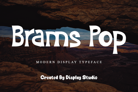
Brams Pop features bold, confident letterforms with subtle irregularities—slightly exaggerated curves, asymmetric terminals, and intentional weight contrasts. These aren’t flaws; they’re design decisions that lend warmth and approachability without sacrificing clarity. On screen, Brams Pop holds its shape at large sizes (48px and up), making it ideal for hero headlines, section titles, and branded banners where impact matters more than paragraph density.
In practice, Brams Pop excels in contexts where hierarchy and tone are tightly coupled: a boutique skincare brand’s homepage headline, a creative course’s sales page banner, or a podcast’s episode graphic. Its visual confidence helps guide scanning behavior—users instantly recognize the most important message on the screen, especially when paired with generous whitespace and intentional spacing. That’s not just aesthetic preference; it’s behavioral design.
For readability, Brams Pop is best deployed in short-form, high-impact roles. Think “Limited-Time Offer” in a promotional banner—not body copy. It works exceptionally well over image overlays (with sufficient contrast and optional text shadows), on light or dark backgrounds alike, and scales cleanly on mobile viewports when used above 36px. Avoid using it below 24px or in dense navigation menus—its charm lies in breathing room, not compact utility.
Visual hierarchy benefits significantly from Brams Pop’s tonal clarity. When placed above clean sans serif body text—like Inter, Manrope, or even system fonts—it creates immediate contrast between voice and information. That pairing reinforces brand tone (playful yet professional, bold yet thoughtful) while preserving scannability and accessibility. For editorial or portfolio sites, consider pairing Brams Pop with a restrained serif like Cormorant Garamond for subheadings—adding texture without competing for attention.
I’ve used Brams Pop across several real-world projects: a coaching website’s hero section (replacing generic “Bold Sans” with something memorable), an online art supply store’s seasonal campaign banner (where its hand-crafted energy matched product photography), and a digital brand kit for a female-led design studio (as the primary logo lockup and social media highlight font). In each case, Brams Pop didn’t just look good—it reinforced messaging intent and increased dwell time by anchoring attention faster.
It’s worth noting Brams Pop is designed as a display font—not a text or interface font—and that distinction matters in web performance and user experience. Its file size remains lean for webfont delivery (WOFF2 supported), and it includes standard Latin character sets with robust punctuation and numeral support. While it doesn’t offer multiple weights or stylistic alternates, its single-weight strength is part of its identity: focused, consistent, and unmistakable. Multilingual support covers Western European languages, making it suitable for many global-facing digital products—but always verify coverage if targeting specific regions.
Font pairing is where Brams Pop shines brightest in production. Pair it with a highly legible, neutral sans serif for all supporting text: paragraphs, form labels, button copy, and footer links. This keeps cognitive load low while letting Brams Pop carry expressive weight. Avoid stacking it with other decorative fonts—no script, no condensed caps, no secondary display type. Its uniqueness is amplified by restraint elsewhere in the stack.
On responsive layouts, Brams Pop adapts gracefully—but only when sized thoughtfully. Use CSS clamp() for fluid scaling: font-size: clamp(2rem, 4vw, 3.5rem); ensures strong presence on mobile without crowding, and commanding scale on desktop. For buttons, reserve Brams Pop for primary CTAs in hero sections only—not secondary actions or micro-interactions. And never use it for inline links or small UI elements; its personality needs space to land.
Licensing is straightforward but essential to address. Brams Pop is a commercial font, meaning usage requires an appropriate license for websites, client projects, online stores, digital templates, and downloadable brand assets. Most licenses cover web embedding via @font-face, unlimited pageviews, and use in SaaS platforms—just confirm the scope matches your deployment (e.g., self-hosted vs. third-party CDN, number of domains, or resale restrictions if bundling into themes or templates).
What makes Brams Pop especially valuable today isn’t just its visual appeal—it’s how efficiently it communicates brand stance. In a landscape saturated with minimalist sans serifs and overused variable fonts, Brams Pop offers distinctiveness without sacrificing professionalism. It signals creativity, intention, and human-centered design—not through gimmicks, but through considered form and digital readiness.
If you’re refining a portfolio site, launching a new product page, or rebuilding a brand’s digital presence, Brams Pop earns its place not as decoration—but as a functional layer of your design system. It supports tone, guides attention, strengthens recall, and does so with technical reliability. That’s rare in display fonts. And that’s why it stays in my active font library—not as a novelty, but as a tool.